Tables should be reserved for presenting tabular data and forms only and should never be used for page layout (this is a deprecated practice rarely seen). There are several reasons for this:
- Revising pages created using tables is difficult and time-consuming. They can lock the developer in a current design because they’re difficult to manipulate with CSS.
- They don’t scale well to different screen sizes.
- Tables are not as web accessible as straight markup. Screen readers can usually handle simple data tables, if coded correctly, but they are unable to read complicated pages designed with multiple nested tables.
With this in mind, all web pages should only be designed using semantic, well-formed HTML and CSS.
When a table is exceptionally long tables resulting in page scrolling, effort should be made fix the header row so it always remains at the top.
Tables don’t always display well on mobile devices because the rows and columns don’t stack like other HTML elements and will cause mobile device windows to scroll horizontally if they are too wide for the viewport. While there are several solutions available, none are perfect so it’s best to avoid it when possible.
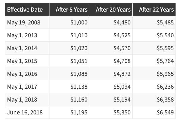
The following is an example of table styled to UFT look & feel standards:
| Effective Date | After 5 Years | After 20 Years | After 22 Years |
|---|---|---|---|
| May 19, 2008 | $1,000 | $4,480 | $5,485 |
| May 1, 2013 | $1,010 | $4,525 | $5,540 |
| May 1, 2014 | $1,020 | $4,570 | $5,595 |
| May 1, 2015 | $1,051 | $4,708 | $5,764 |
| May 1, 2016 | $1,088 | $4,872 | $5,965 |
| May 1, 2017 | $1,138 | $5,094 | $6,236 |
| May 1, 2018 | $1,160 | $5,194 | $6,358 |
| June 16, 2018 | $1,195 | $5,350 | $6,549 |
