Forms and form design are the main aspect of web applications. They can be extremely complex because there are thousands of different scenarios and processes the developer can encounter. By following certain accepted heuristics, usability and process completion will be consistent in applications within UFT applications and sites.
General form Usability rules
The following guidelines should be applied to all form entry fields.
Text Entry fields
- All entry fields should remain consistent throughout any application and should be clearly labeled and identified for users.
- Text Boxes are appropriate for use with open-ended questions where users can type in the answer
- Free Form Text Area: Text areas should be used for open-ended question where users can type the answer. They should always be displayed with a minimum of two rows to indicate that longer information is allowed.
Radio buttons, checkboxes and dropdowns
- Checkboxes should be used if there are multiple options and users can choose more than one
- Radio buttons should be used when there is a simple question and only one choice can be made.
- Drop-down select fields should be used when there are multiple options, but users can only choose one.
- Radio buttons are preferable to drop-down menus: Radio buttons make all options permanently visible so that users can easily consider them.
- A default selection should usually be made for radio button lists. If no selection is an option, there should be a “none” option rather than leaving all of them unselected.
- Let users select an option by clicking on either the button/box itself or its label: a bigger target is faster and easier to click. In HTML forms, you can achieve this by coding each label with <label> elements or by using javascript.
- Never use radio buttons or checkboxes to launch an action. Users don’t expect an action to occur when either of these elements are clicked. Use a button instead.
- If you offer users four or more options, use a dropdown box. If it’s three or less, use radio buttons, so that the options won’t be hidden. Radio buttons should be displayed in one column unless they have very short descriptions (like “Yes” and “No”).
Passwords
- Password fields should only be used for accessing an application. Not for initial password creation.
- Users should be given the option of viewing their password as they enter it.
Buttons
- If your form (or transaction step) is short, place action buttons after the form at the bottom. If it’s a very long form, consider placing the buttons at the top or fixed in place so when the user scrolls, the action buttons are always available to them.
- Until all required fields are entered disable “Submit” buttons to reduce errors and ease user frustration.
- Don’t use too many buttons: This increases complexity and potentially confuses the user. Use links or icons instead and reserve buttons for important actions like “Submit”.
- Avoid using “Reset” buttons. Reset clears away the user’s input on a Web form forcing them to reenter information. This is the best way to ensure a user will NOT complete a form.
- Don’t use buttons as navigation UNLESS it’s part of the workflow process. A “Continue” button in a stepped wizard is an example of this.
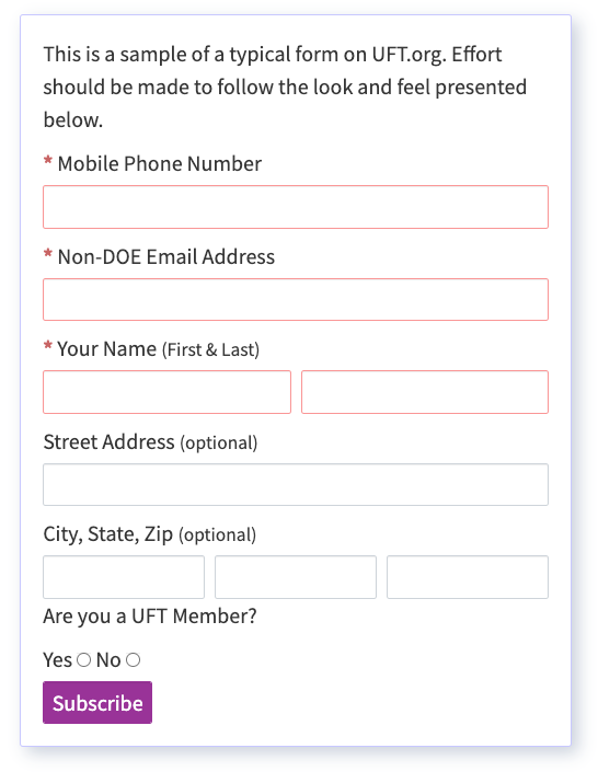
UFT Form Example
Additional basic form usability rules
Some additional guidelines should also be followed to make form completion easier for users:
- Required fields should be clearly indicated with either an asterisk, bolding or color of some kind (often red is used). If all the fields are required,it should be indicated prominently before the form.
- Field text should be left justified EXCEPT for numbers in calculator-style applications, which should be right justified to align decimals.
- Show Users the proper input format. If you’re asking your users for a specific input format – such as a phone number or credit card number – show them the proper way to fill it in. If a credit card field requires 16 numbers, prefill the field with indicators or give an example. This reduces uncertainty and improves the likelihood of form completion.
- Short instructional text should be used before every form.
- Fields require proper focus when a user enters information. If the field has sample text, it should clear out on focus, for example.
- Upon opening a form, focus should fall on the first editable field. For longer forms, using the “tabindex” attribute will make it easier for users to “tab” through forms in a logical order as users should be able to tab thru forms fields in the proper order intended
- If linking to another page, such as FAQ’s or Help, the link should open in a new window so as not to take the user away from the form unnecessarily.
- If number fields need to be entered and calculated, the form should always calculate dynamically for the user.
- Visual cues that allow the user to self-correct should be included throughout the process. This can be dynamically generated error overlays that would show up when the user enters the wrong information in a field.